Analysis by “Sevakis Skeptilytics”
Late yesterday afternoon I received the following from one of my B-School buddies:
The forwarded email included the following description:
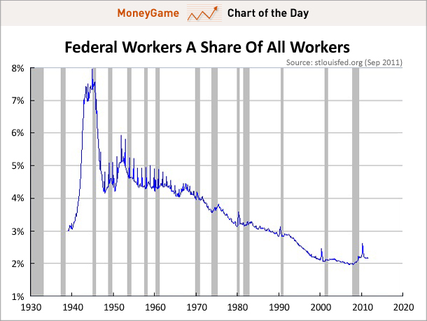
The Incredible Shrinking Federal Workforce
Another myth debunked: Contrary to your belief that the Federal government is growing and growing in terms of its role in the government, it turns out that in one crucial respect, it’s actually shrinking.
As a share of all workers, Federal workers have been declining pretty steadily over the last several decades. That number has risen a little bit under Obama — due to some growth in the Federal workforce and the dramatic shrinking of the private workforce — but the ratio is still near the all-time rock bottom.
(via Matt Busigin) Read »
As per usual, data that are combined to give percentages tell a very limited story and often truncate rather than further understanding. This is certainly the case when budget numbers are analyzed as percentages of GDP without any mention of specific dollar amounts. Don’t know of any organization, including governments, that actually budget in such a fashion. Anyhoo. . .
If you go to the source of the graph given by “Business Insider” you will find the following slightly different presentation:
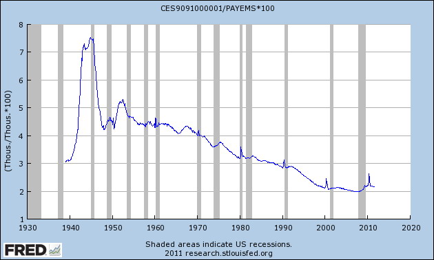
http://research.stlouisfed.org/fredgraph.png?g=26b (Please note how the vertical scale of the first chart is exaggerated when compared to one directly above.)
This graph was generated by using a resource of the St. Louis Federal Reserve called, appropriately enough, “FREDgraph” which permits one to generate custom charts through the combining of available data sets using a formula of one’s own creation. Viola! We have now demonstrated that we have an “Incredible Shrinking Federal Workforce.” “Not so fast!” says me. What’s a percentage of what, and what about all government workers? Why just federal? Don’t the AFSCME and NEA emps get paid to? Aren’t they also a “burden” on the economy?
The chart given above was created using FREDgraph by combining the data for this chart:
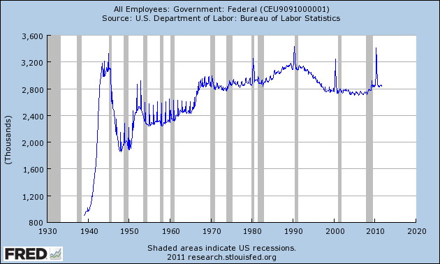
http://research.stlouisfed.org/fred2/series/CEU9091000001?cid=32325 (Note that the absolute number of federal employees has not “shrunk”, but rather has remained essentially constant for the past 45 years with spikes in census years.)
with the data for this one:
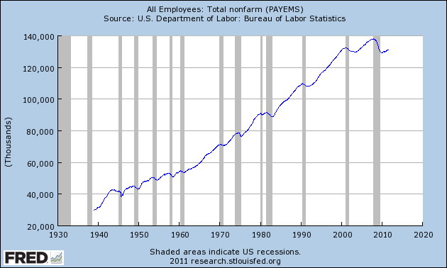
http://research.stlouisfed.org/fred2/series/PAYEMS?cid=32305
The number of ALL government employees is given by the following:
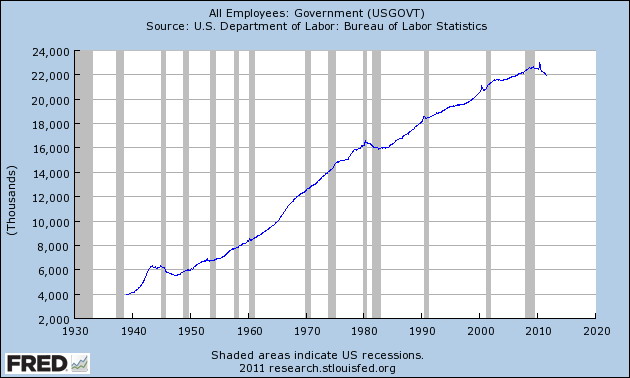
http://research.stlouisfed.org/fred2/series/USGOVT?cid=32325
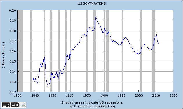
which when combined with “PAYEMS” yields the following result:
Presto, change-o! A bit of a different picture, isn’t it?
This does not, of course, give one the entire picture. In economic terms, numerical employment percentages are not nearly as important as would be, for instance, percentages of total payroll. Also, most government jobs are not wealth creating. And the benefits associated therewith, as recent headline events have pointed out, are among the best offered by anyone, anywhere.
From a political standpoint, what I find most interesting is the recent rise in the percentage of government workers. After peaking in the mid-seventies, the percentage of government workers generally declined for the following 25 years. For the last 10 years, since the beginning of the Bush II administration, that trend has reversed and been upward overall. So, when I hear comments about the Obama Administration being merely a continuation of Bush policies, s’pose I should concur. That troubles me. Not because of what that says about Obama, but rather, what it says about Dubya’s presidency.
Besides, how do you decide what percentage of the labor force should be U.S. Government employees? As Tina might say, “What’s that got to do with it?”
Ciao,
Dennis

